Atlassian Guard
Highlighting key security features to improve user understanding and navigation.
Role: Product Designer, Atlassian Growth Team
Timeline: Q1 2024
01
Context
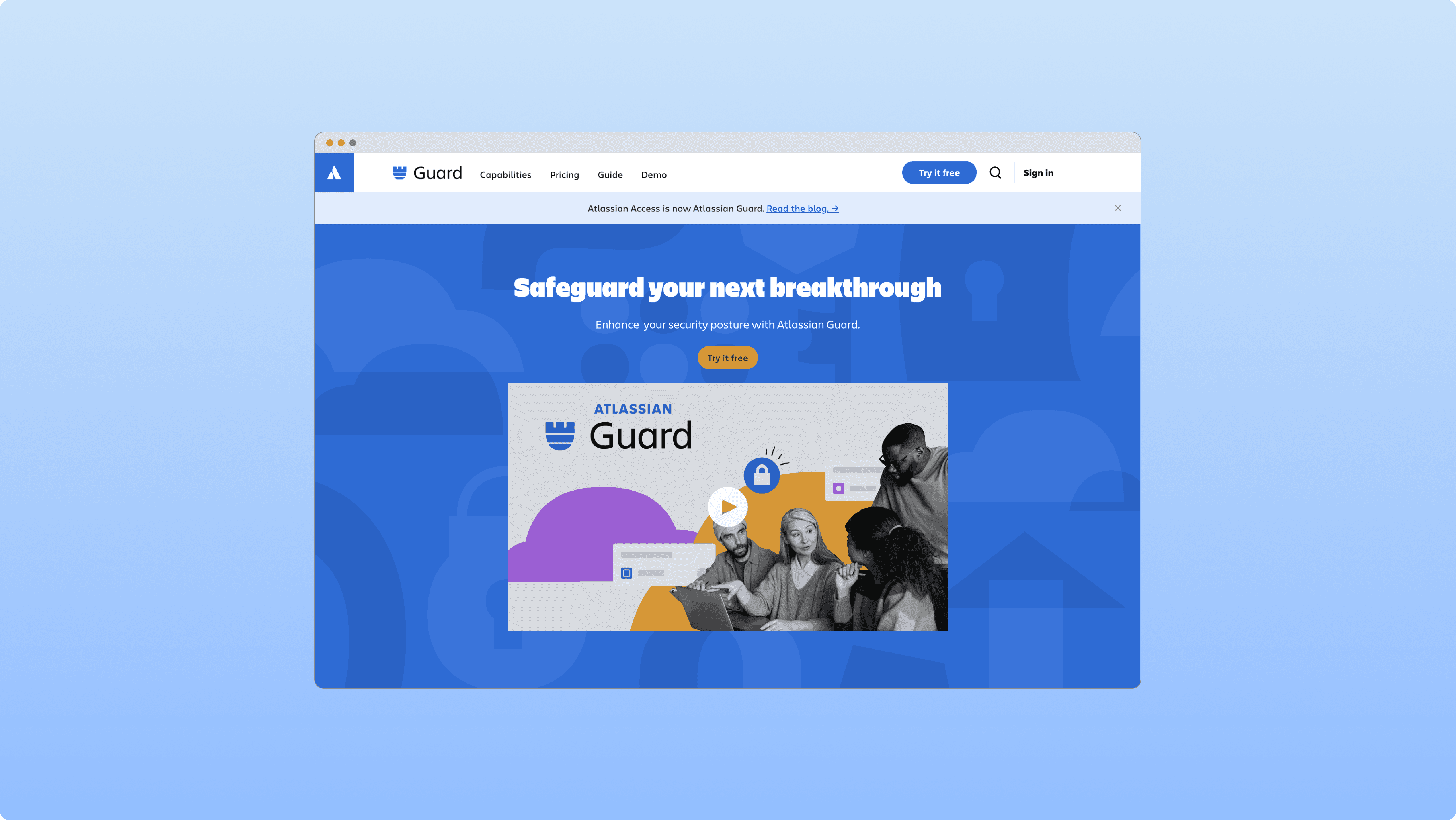
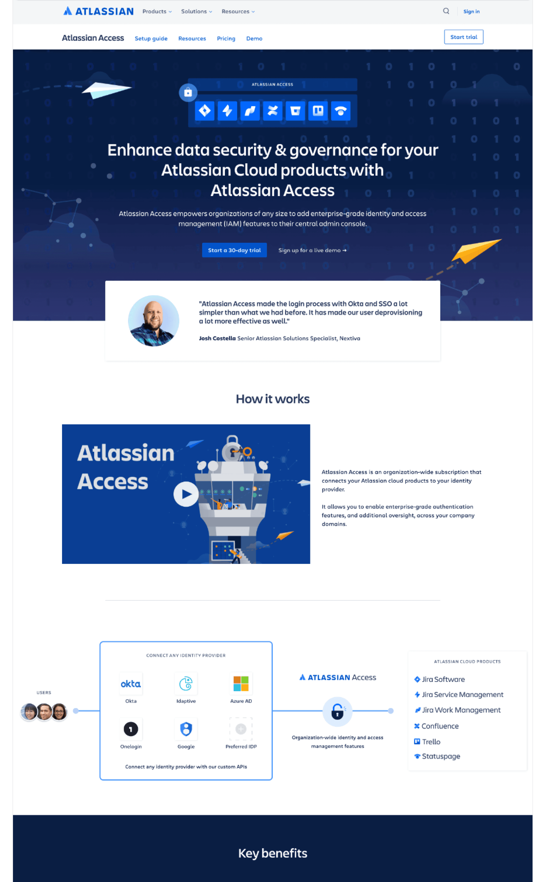
Atlassian Guard is a new security product offering enhanced capabilities in data protection, threat detection, and response. This page aimed to clarify Guard’s unique value, replacing the older Atlassian Access information and guiding users to explore Guard’s expanded security features.
Previous landing page (Atlassian Access)
02
Problem
03
Goal
04
Challenges
Clarifying Guards value
The page needed to make Guard’s complex features accessible at a high level without overwhelming users.
Balancing user needs with business goals
I had to ensure users could easily navigate Guard’s features while motivating trial sign-ups.
Adhering to design constraints
Working within the existing design system and a tight timeline, I prioritized simplicity and clarity.
05
Solution
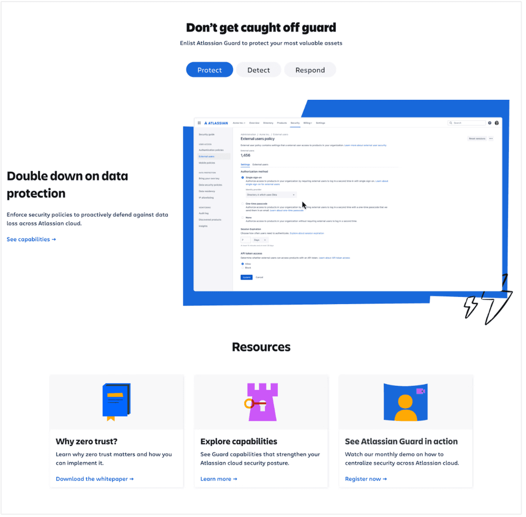
I structured the content around three main pillars to simplify complex information, integrating resource cards within tabs to enhance clarity and collaborating with the web producer to ensure seamless implementation within the design system constraints.
06
Handoff
I provided responsive wireframes aligned with design system guidelines, ensuring that typography, grids, and components adhered to best practices.
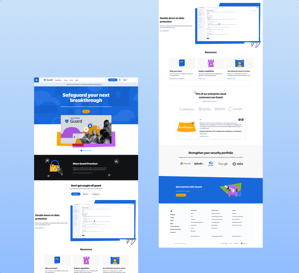
Screens after visual designer
07
Final Design
The final design showcased Atlassian Guard’s features—Protect, Detect, and Respond—at a high level, with navigation to deeper pages for detailed info, all aimed at driving trial sign-ups.
Screens after visual designer
08
Impact
The new design achieved a 40% increase in engagement within its first month, accompanied by a significant rise in trial signup.
09
Next Steps
Track analytics
Track user flow and engagement on the landing page to understand where users engage most and where they drop off. Use these insights to optimize navigation and highlight the most impactful features.


